A new voice for the longest-running festival in the world
Pinkpop
Question
Develop a new visual identity for the longest-running pop festival in the world, which has been the favorite among both the audience and artists for decades. We want to attract a younger demographic without alienating the loyal Pinkpop visitor.
Approach
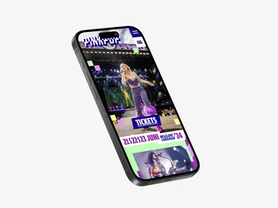
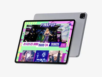
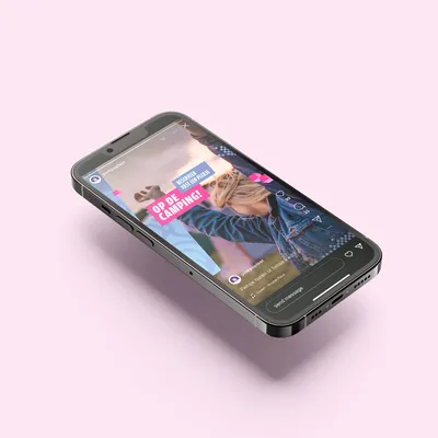
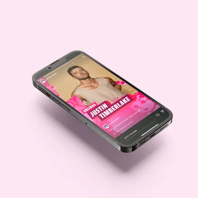
With respect for the heritage and iconic strength of the pop logo from 1973, we created a brand identity system in which both the logo and style elements can be used flexibly. This allows us to easily update each edition and continue to build on the strongest brand in the festival world in the future.
Result
Pinkpop now has a functional brand identity system that meets the demands that new times and new media impose, with a renewed yet familiar iconic strength. The new communication style also achieved the desired rejuvenation: Pinkpop now sees an annual increase in the share of visitors aged 12-16.


Move the earth, light the sky
For 3 days each year, something unique happens: stars from all over the world literally and figuratively descend in Landgraaf, and thousands of people jump simultaneously to the thumping music. With a wink to the iconic moments of Pinkpop, such as the measured earthquake during Rage Against The Machine and the comet during Foo Fighters, we honor the grandeur of the festival and its rich history. Move the earth, light the sky is an ode to all the fans who make the ground tremble and all the artists who bring the festival to life and make it unforgettable.