Fitting appearance for one of the most renowned techno festivals
Soenda
Question
Techno enthusiasts from the very beginning know Soenda as a name that holds on to the roots of the genre. With multiple editions three times a year welcoming between 30,000 to 50,000 ecstatic visitors, Soenda desired a distinctive branding that fits the status of the festival.
Approach
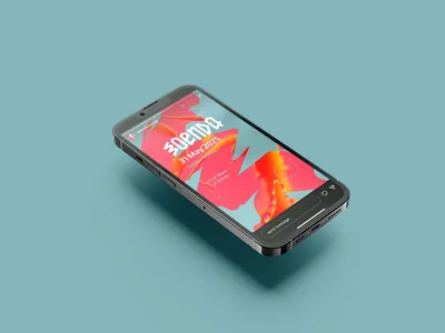
Together with Soenda, we started at the core. What should the appearance do, how will the visitor visually recognize what you stand for as a festival? Thus, a clear visual identity emerged with logo, imagery, motion, glitches, and color schemes. Each edition receives a tailored version with its own unique appearance, applied to posters, social media, and animations.
Result
Soenda is strengthened with a strong branding and visual style as a foundation. With each new edition, the artwork adapts to this, as a variation on a previous edition within the branding. This results in a now recognizable, unique appearance that belongs to a reputable name within the scene, which we have been doing together for over ten years.